stratégie branding brandcontent ux/ui
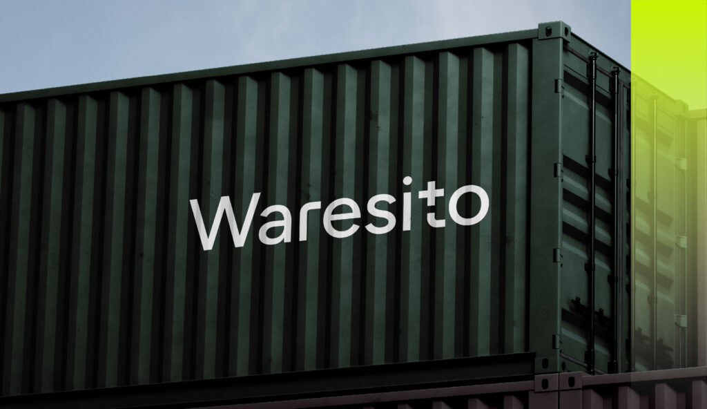
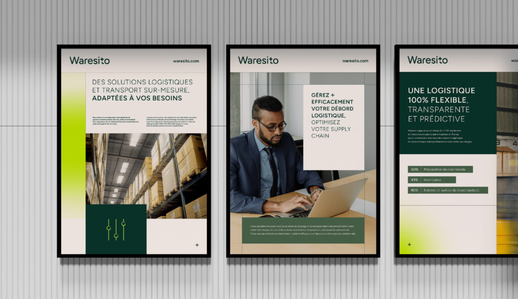
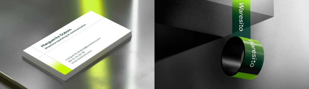
L’identité visuelle et le branding de Waresito reposent sur une approche moderne et technique, visant à refléter ses valeurs de flexibilité, de transparence et de durabilité. Le logotype est conçu avec une typographie sans-serif précise, technique et flexible, ce qui renforce l’expertise logistique de la marque. Le signe « + » caché à l’intérieur de la lettre « t » symbolise la valeur ajoutée de Waresito : « Un plus pour votre logistique. »