BRANDING

ACTIVATION, ART DIRECTION, BRANDING

Official Hospitality of Paris 2024

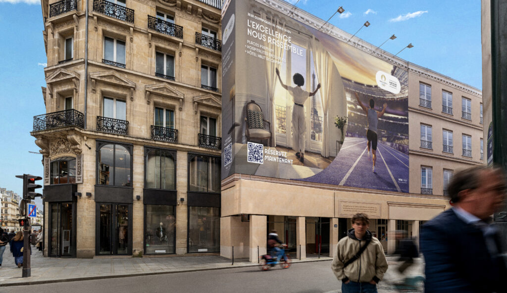
Official Hospitality of Paris 2024 This project was developed in collaboration with Paris 2024 — Official Hospitality, with the goal of supporting them both before and during the Olympic Games. The visual identity is derived from the official Olympics branding, while taking a creative step aside to stand out. A key challenge was the brand architecture, designed to highlight the range of services offered. Several advertising campaigns marked the different phases of this collaboration. W/ TYPES TOP STUDIO BRANDING Brand territory development IA MIDJOURNEY ADVERTISING SOCIAL MEDIAS https://elyseniezgoda.co/wp-content/uploads/2025/05/ELYSE_P24_BRANDING_STUDIO_DESIGN_12.mp4 https://elyseniezgoda.co/wp-content/uploads/2025/05/ELYSE_P24_BRANDING_STUDIO_DESIGN_11.mp4 https://elyseniezgoda.co/wp-content/uploads/2025/05/ELYSE_P24_BRANDING_STUDIO_DESIGN_10.mp4 Previous

ART DIRECTION, BRANDING

Waresito

Waresito The visual identity and branding of Waresito are based on a modern and technical approach, aiming to reflect its values of flexibility, transparency, and sustainability. The logotype is designed with a precise, technical, and flexible sans-serif typeface, reinforcing the brand’s logistics expertise. The hidden « + » sign within the letter « t » symbolizes Waresito’s added value: « An extra plus for your logistics. » W/ TYPES TOP STUDIO ART DIRECTION BRANDING UI/UX DESIGN Previous Suivant

ART DIRECTION, BRANDING

Mobilize

Mobilize Mobilize is a new brand from Renault that aims to become a leader in electric leasing. For this new identity, we have developed an entire territory by playing with the graphic elements of the logotype, which includes a bold, modern font and a unique, dynamic symbol. We were able to bring this new identity to life across a range of media, including business cards, badges, vehicle markings, and signage. This has helped to establish a strong and consistent brand presence for Mobilize, and communicate its values and vision to customers and stakeholders alike. W/ 4UATRE BRANDING Brand territory development COVERING https://elyseniezgoda.co/wp-content/uploads/2025/02/intro.mp4 Previous

ART DIRECTION, BRANDING

The People

The People The People Hostel is a unique and innovative concept that combines the comfort of a hotel with the community and social aspectsof a hostel. The hostel aims to create a home away from home for its guests, where they can connect with locals and other travelers. The hostel’s branding is carried through to every touchpoint, from the website and social media channels to the physical space itself. The hostel’s interior design is inspired by the local culture and heritage, creating a unique and authentic experience for guests. W/ 4UATRE BRANDING Brand territory development EDITION https://elyseniezgoda.co/wp-content/uploads/2025/01/CAS_THE_PEOPLE_18.mp4 https://elyseniezgoda.co/wp-content/uploads/2025/01/CAS_THE_PEOPLE_19.mp4 Previous

ART DIRECTION, BRANDING, UX/UI DESIGN

Proneli

Proneli The visual identity and branding of Proneli embody the harmony between the two hemispheres of the brain — logic and creativity — celebrating connection, stimulation, and transmission. The logotype balances softness and sharpness: its round forms reflect humanity and openness, while subtle edges reveal the brand’s unique character. Proneli stands out as a brand of contrast and depth — both welcoming and distinctive. Concept explored but not selected by the client. W/ TYPES TOP STUDIO ART DIRECTOR BRANDING https://elyseniezgoda.co/wp-content/uploads/2025/05/ELYSE_PRONELI_BRANDING_STUDIO_DESIGN_4.mp4 Previous

ART DIRECTION, BRANDING

Idemia

Idemia The project to streamline Idemia’s graphic codes aims to give renewed meaning to the graphic elements, both in their form and their usage, in order to create a strong and instantly recognizable image. By codifying the use of these elements, the brand revitalizes their communicative potential. Every stroke, every color, and every composition is carefully designed to reflect Idemia’s unique identity while enhancing its visual presence FREELANCER W/ CREADS BRANDING RATIONALIZATION Previous Suivant

ART DIRECTION, BRANDING

ELF

ELF This project of rebranding was entrusted to the agency 4uatre with the goal of breathing new life into a forgotten brand. We created a fresh and vibrant brand identity by incorporating brighter shapes and colors. We redefined the entire brand territory and formalized it with a new graphic charter and multiple templates. Throughout the project, I was able to expand the brand’s reach by adapting it to various media. W/ 4UATRE BRANDING Brand territory development EDITION Previous

ART DIRECTION, BRANDING

Hermès

Hermès For the Hermès FW23 shoe season, I created a digital platform to show-case the new collection. Designed for salespeople, this platform allows them to pre-order the new models and provide information about the different shoes. This season was focused on surprise.The artistic direction was led with this in mind. The overall idea was to play with digital codes, particularly pop-ups and various appearances, to create surprise W/ 4UATRE BRANDING UI DESIGN https://elyseniezgoda.co/wp-content/uploads/2025/01/20ELYSE_DESIGN_H_4UATRE-1.mp4https://elyseniezgoda.co/wp-content/uploads/2025/01/19ELYSE_DESIGN_H_4UATRE-1.mp4 https://elyseniezgoda.co/wp-content/uploads/2025/01/21ELYSE_DESIGN_H_4UATRE-1.mp4 https://elyseniezgoda.co/wp-content/uploads/2025/01/22ELYSE_DESIGN_H_4UATRE-1.mp4https://elyseniezgoda.co/wp-content/uploads/2025/01/23ELYSE_DESIGN_H_4UATRE-1.mp4 https://elyseniezgoda.co/wp-content/uploads/2025/01/24ELYSE_DESIGN_H_4UATRE-1.mp4 Previous

BRANDING, UX/UI DESIGN

Mathilde Bennett

Mathilde Bennett Mathilde Bennett is a Norman artist with a unique profile. As an artist and scenographer, she adapts to the various opportunities her career presents. Her work is inspired by the sea, sand, foam, and pebbles, and she enjoys playing with different scales. The visual identity created for Mathilde Bennett embodies her ideas, featuring organic shapes that play with various scales. FREELANCER ART DIRECTION BRANDING UX/UI DESIGN EDITION https://elyseniezgoda.co/wp-content/uploads/2024/11/Capture-decran-2023-02-05-a-22.09.49.mp4 https://elyseniezgoda.co/wp-content/uploads/2024/11/Top-View-Book-Mockup.mp4 Previous Suivant

ART DIRECTION, BRANDING, EDITORIAL DESIGN

Chai Pascal

chai Pascal Chai Pascal is a wine restaurant located in Saint Emilion, Nouvelle Aquitaine. The new branding is centered around the main product: wine. The restaurant aims to show- case the winegrowers of the region, as the owner is also a viticulturist and produces her own wine. It was important to place this product at the center of the branding FREELANCER ART DIRECTION BRANDING EDITION Suivant